Screen-printing at SVA, Spring 2018
- May 2, 2018
- 1 min read
I just finished up my second screen-printing class at The School of Visual Arts. This time around my instructor was Shannon Broder who helped me so much to avoid more and more of the subtle pitfalls of the process.
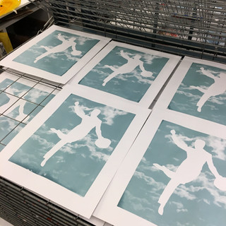
My big improvement this semester was 2-color printing! My movie/TV prints allowed me to focus on registration as well as continuing to get a solid print.
I used fluorescent inks, metallics, and more Glow-in-the-Dark inks.
About midway through the semester I realized my new-found obsession with the late-19th century font, Akzidenz Grotesk, a precursor of Helvetica, Futura, Univers, and the rest. So I started on a tear printing 'font art' on black t-shirts and on super heavy-weight Canson charcoal black paper in metallic silver and gold ink.


Comments